This is the brief that I have been given for my course work for Media:
To design a front cover, contents and double page spread of a new music magazine. All images and text used must be original, and a minimum of 4 original images must be used
Tuesday, 23 October 2012
Monday, 15 October 2012
Evaluation
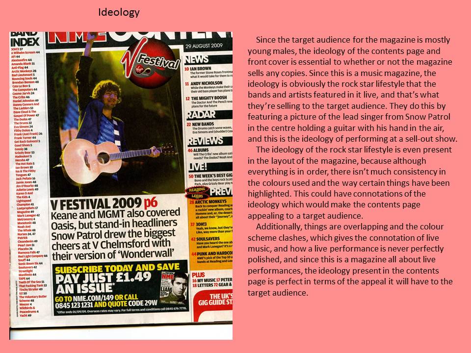
My finished
magazine is called WCM, which stands for Wyke College Magazine, and it uses
several media conventions to make it obvious that it’s a magazine. For example,
it has the main masthead at the top of the page and I have used a block font to
make it stand out. I have also used black as the colour for the masthead as
this colour made the masthead stand out against the natural background of the
image beneath it. Colour scheme was another convention I used for my magazine,
as most magazines only seem to have three colours at one time on the cover
page, so I took this rule and also only used three colours, which were black,
blue and white, as I felt that they stood out best against the background image
when I placed all of the story lines around the background image.
I also used block
fonts for the main headlines I featured on my front cover as I felt that these
stood out best and they were also visible against the background which was a
difficult task as I used a very light image that was taken outdoors so the
colours can sometimes make small fonts harder to read, especially with the
colour scheme I used.
In terms of the
actual image I used, I also followed conventions then, and I also made the
ideology clear with the image I used as I used a picture of someone smiling
outdoors holding their file, which shows the ideology of someone getting an
education at college and enjoying it, and it also follows the conventions as I
used a medium shot which is the most common type of shot that is used on a
magazine cover. The reason that I chose to use the image that I did was because
after looking at several examples of college magazines on my mood board, I
decided that I really wanted a light and simple look for my cover as sometimes
the magazine can look very tacky if there is a lot going on, but it hasn’t been
put together very well in the image.
In the magazine
image, I have used the mise-en-scene to stereotype the typical student by
placing them in a bright outdoor location with their file and smiling at the
camera. Using this kind of image almost gives the ideology of the ideal student
in my magazine, so I thought that this would be appropriate. Using the
stereotype of such a student also goes against global stereotypes of students
as most people of an older age group think of students as being trouble causers
and that students are always up to no good, so I thought I would use this image
to move away from this stereotype of the modern day student.
For the target
audience of my magazine, it isn’t really aimed at a specific gender or
anything, but I took the stereotype of a student at college after looking at
examples of other magazines and decided that it would look a lot more like an
actual college magazine if I used the stereotype of someone stood on the
college grounds holding all of their work happily. Since the person that I
photographed isn’t wearing a uniform it is quite clear that the main age group
for this magazine is students; the lever arch that the person in the image is
wearing is also an indicator to the age group that the magazine is targeted at.
WCM appeals to my
target audience because I have included headlines about saving money, which is
a well-known problem amongst students as there aren’t many jobs going for
younger people in this modern economy, so I thought that to make it appeal to
the target audience, I need to include some kind of advice page on the
nationally renowned issue of money. I have also put a potential solution to
this issue as I have included a competition where the prize is £500 in shopping
vouchers so this would definitely attract students to buy and read the magazine
if they have the chance of winning money for new clothes or something.
I have also
written an article about the latest upcoming college parties that the students
must not miss out on, so the magazine will appeal to my target audience by
making them feel up to date on the latest social events that they should be
going to and this could ensure ‘customer loyalty’ as people might pick up the magazine
on a regular basis to keep checking the latest up and coming events that they
want to attend.
The overall look
of the magazine will appeal to the target audience also, I feel as it uses
bright colours and it doesn’t feature a boring image that has no colour. The
use of bright colour schemes and images gives the cover an overall feel of
youth and energy, which is something that I feel, is essential to a college
magazine, otherwise young people wouldn’t be interested in it.
When it comes to
the technology part of the magazine, this is where I really struggled. I find
it very hard to work with Photoshop at times and I make errors on a regular
basis. For example, when trying to edit text that I have already placed on my
image I tend to forget that I have to click on the specific layer and then try
to edit the work, and I just end up deleting the piece of text because I think
it’s not working. Before I had taken my images, I had already got a basic
layout for the text and the barcode, but when it came to placing my image into
the layout I also struggled; I didn’t realise that I had taken the image
horizontally, so it wasn’t long enough to fit onto the A4 layout I had created,
so I had to open it into a new page on Photoshop, enlarge it, and then place it
back in the layout. This is because every time I tried to enlarge it in the
layout, the layout and the image would both be enlarged and this wasn’t what I
wanted to happen at all.
I feel that I am
happy with my overall product in terms of my magazine, but if I had the chance
to do this task again, I would look at camera angles and shots a lot more
carefully to ensure that my image is 100% appropriate for the magazine. I would
also try and make the ideology of the magazine a bit more relaxed and fun, as I
feel like the language I used was quite formal so this is something I really
need to look at when completing tasks in the future.
Overall, I think
that I did reasonably well in this task and I am happy with the final outcome
of my finished product. I feel that I did well in the overall making of the
magazine cover, as I feel that my finished product really looks like a magazine
a college would produce, however, I feel that I really struggle when it comes
to the technical side of things and this is something that I really need to
work on to ensure that my final product is up to the highest standard possible.
Word Count: 1,222


Monday, 8 October 2012


Tuesday, 2 October 2012

Subscribe to:
Posts (Atom)